If you’re an eCommerce retailer, then this article is for you. But, if not, feel free to stick around because we’ve got some news.
We’re sure you already know everything there is to be known about online shopping by now. But do you know all about the latest figures and what it takes to roll the dime? What happens behind “closed doors”?
Well, rest assured, we’ve got you covered. In this article, we’ll walk you through all the bits and pieces that make a successful online store, best case practices, how to discover your niche, and how to hit the jackpot. So you’d better buckle up because this ride is about to start!
Online Shopping Statistics – Do the Numbers Count?

Though brick and mortar stores still generate more sales than online stores, there is steady growth in online stores. Wonder why? Needless to even mention the current pandemic situation and how much more convenient it is for people to shop from home, sitting at their desks.
To give you an idea of how big the industry is, let’s start with general online shopping statistics.
E-commerce sales are expected to surpass $740 billion by 2023 in the United States alone. As a result of several factors, an increase in online sales is attributed to the growing use of smartphones and mobile shopping, social media and social trading, revolutionary technology, online markets, and the way shopping habits have shifted from generation to generation.
However, the US is not the only leader in the online retail sector. People all over the world recognize the advantages of it. As per Invesp statistics, the countries with the highest average e-commerce sales per customer are:
- United States ($1,804)
- United Kingdom ($1,629)
- Sweden ($1,446)
- France ($1,228)
- Germany ($1,064)
- Japan ($968)
- Spain ($849)
- China ($626)
- Russia ($396)
- Brazil ($350)
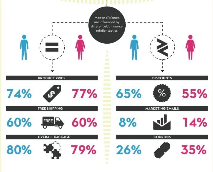
If we look at stats by gender, the distinction between the percentage of male and female shoppers is not so far-fetched: 👇
This is why it is utterly important to know who your target audience and niche are. Buying decisions can change depending on the gender of the consumer. For example, what women might find amazing, men might find ordinary.
For this reason, staying ahead of the eCommerce market trends and knowing what your product is capable of and who your customers are can help you create sophisticated strategies and establish eCommerce success shortly.
Online Shopping Facts You Gotta Know About
- Clothing is the leading online vertical
Besides the large clothing companies, many smaller online clothing retailers are growing faster than Amazon. In addition, many are digitally native and vertically integrated, which means that they control every step along the way from clothing design to direct purchases to consumers.
59% of U.S. shoppers bought online clothing, with books, movies, music & games, shoes, and consumer electronics close behind.
- When it comes to mobile-friendliness, Amazon takes the podium
A study in September 2019 found that the most popular online mobile shopping app, by scope, was Amazon, amid seeing a rise in cognitive strategies. This statistic tells us that when designing an online sales strategy, mobile commerce, particularly mobile apps, is critical.
- The best traffic sources are: SEO, direct site, and email marketing
The success of Ecommerce is more than a pretty website. You need a healthy amount of traffic to your online store. Email and SEO were the leading traffic drivers in a recent Statista survey, followed by direct traffic. With direct traffic, there’s a catch. Strong brands have plenty of direct traffic, but they should check if tracking is done correctly for tinier ones. If URL tagging is not well implemented, it might qualify as direct traffic.
- Almost 50% of consumers research the product via networks before purchasing
The industry has seen growth in the power social media has in users’ buying awareness and decisions with the implementation of more social commerce tools, such as checkout on Instagram. 51% of global internet users aged 16 to 24 years used social networks to study their online products in the first quarter of 2019.
- The #1 cause for cart abandonment is high shipping costs
Although fast shipping is in full swing, high spending isn’t for it. In a survey of U.S. shoppers over the age of 18, the primary explanation for cart abandonment for online purchases was found to be elevated shipping costs.
Now that we’ve crushed the numbers and done a bit of research, it’s time we move on to our Product Page. 👇
Product Page Elements
Although social media plays an important role in getting traffic to your e-commerce website, we often tend to forget the design components that transform product pages and give us the ultimate “wow.” To convert your customers into sales, you need to invest in a robust and highly optimized product page that appeals to your audience.
Elements Above the Fold
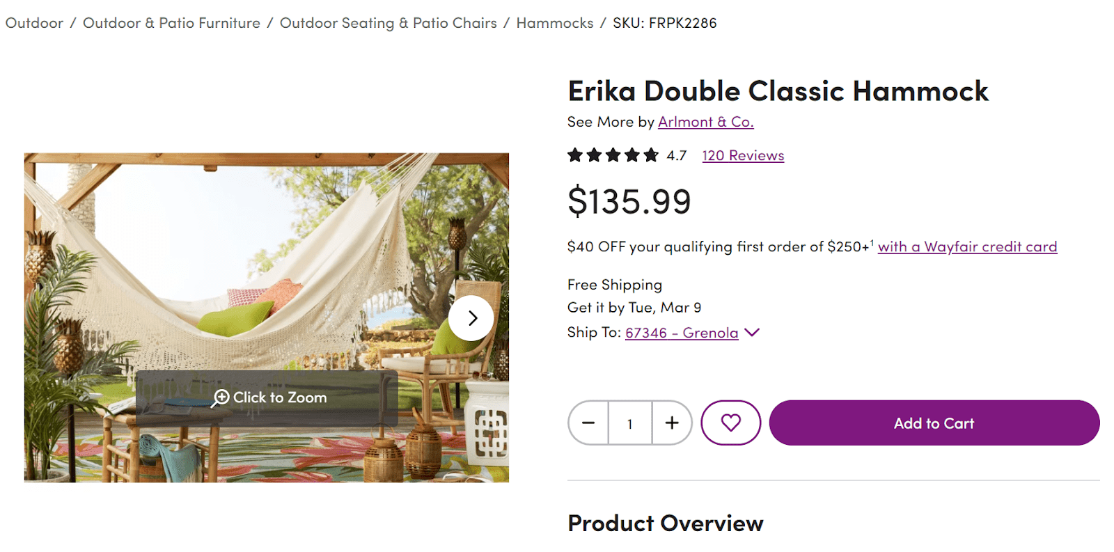
- Product Name
A product name is the first step you need to consider. To create continuity in your brand identity and logo, the correct product names will help you. In addition, the more reliable you are, the more likely your clients will trust you.
2. Product SKU
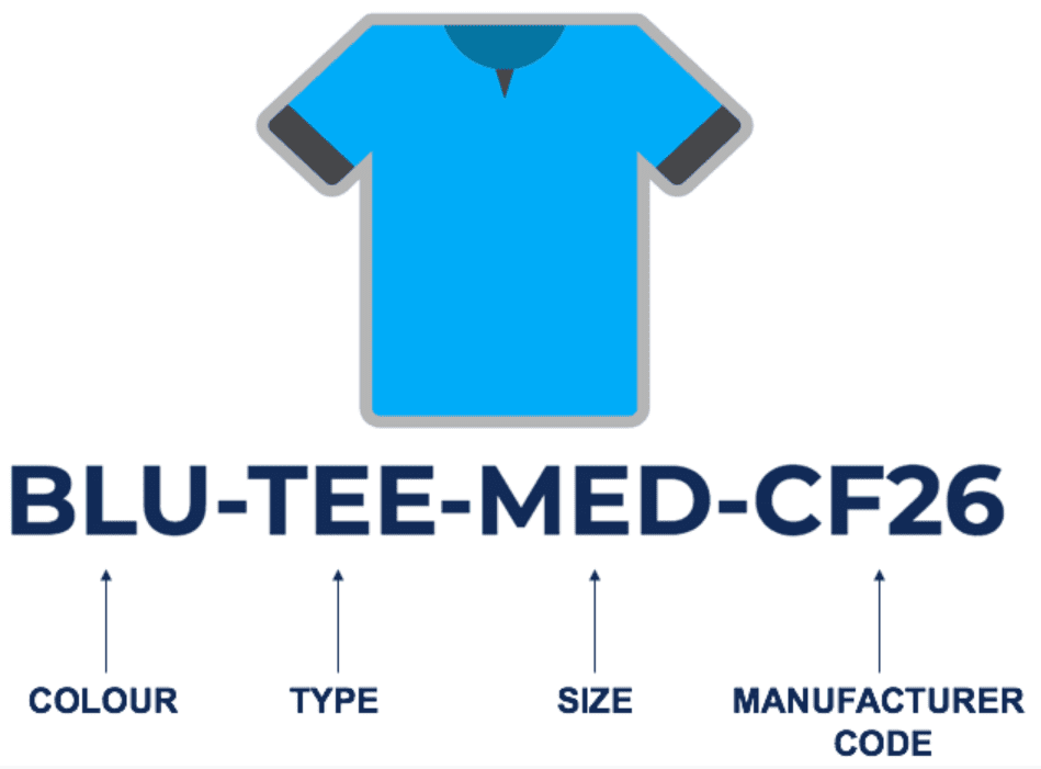
The Stock Keeping Unit is an alphanumeric inventory code that allows retailers to track their stock, evaluate sales by product and category, design store layouts, and improve customer experience.
SKUs help distinguish products from each other. It would not be easy to track sales and inventory without classifying them by model, type, color, size, or other identifying features. For clients who are regular shoppers and want to re-buy an item, an SKU can save them a lot of time.
3. Who is selling the product
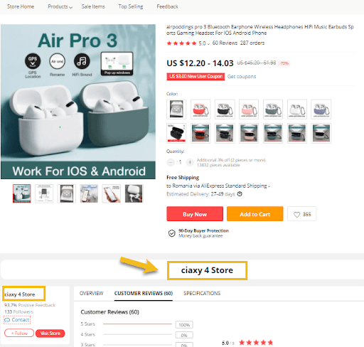
Customers migrate to passionate sales workers who are enthusiastic about their products and willing to share the advantages with them. Adding an extra paragraph about the seller and their personality might come in handy. However, it’s important to mention that this strategy is mostly available for Amazon, eBay, Aliexpress, etc.
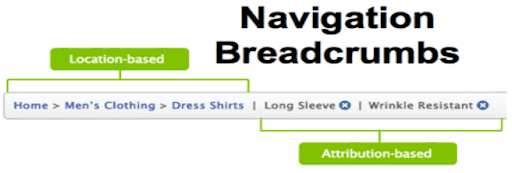
4. Breadcrumb navigation
It helps to group the product into categories and makes it more transparent to the consumer. Moving to a larger category will be easier instead of searching again. They’re also a great source of contextual information for landing pages because they’re an important visual aid that displays the user’s role inside the website’s hierarchy.
5. Product visuals, images, video
At first sight, visuals seem not to do much. However, that’s not quite true. Visuals don’t just stand out – they are easier to recall, too. So make sure to add visuals and high-quality images to well-researched content, and you’ll find that it will more likely resonate with its audience.
6. Most important product and features
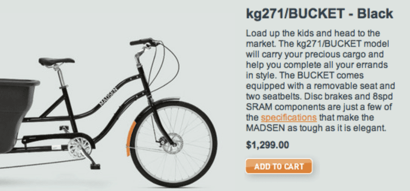
A persuasive product description provides customers with details about the features, issues it solves, and other benefits that help generate sales.
Let’s take a look at a couple of examples: 👇
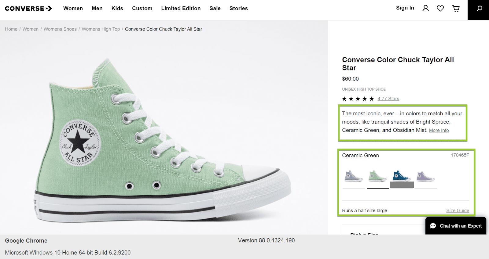
- Fashion industry:
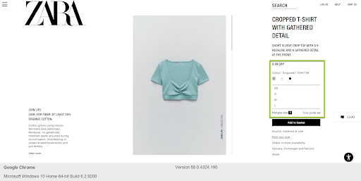
Showcasing multiple color variations and a detailed product description.
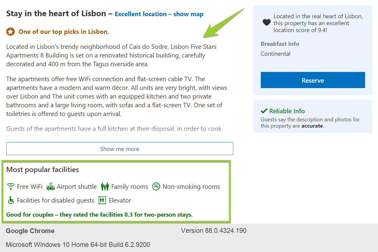
- Travel and Leisure industry:
Including all the important facilities of the accommodation and a detailed description.
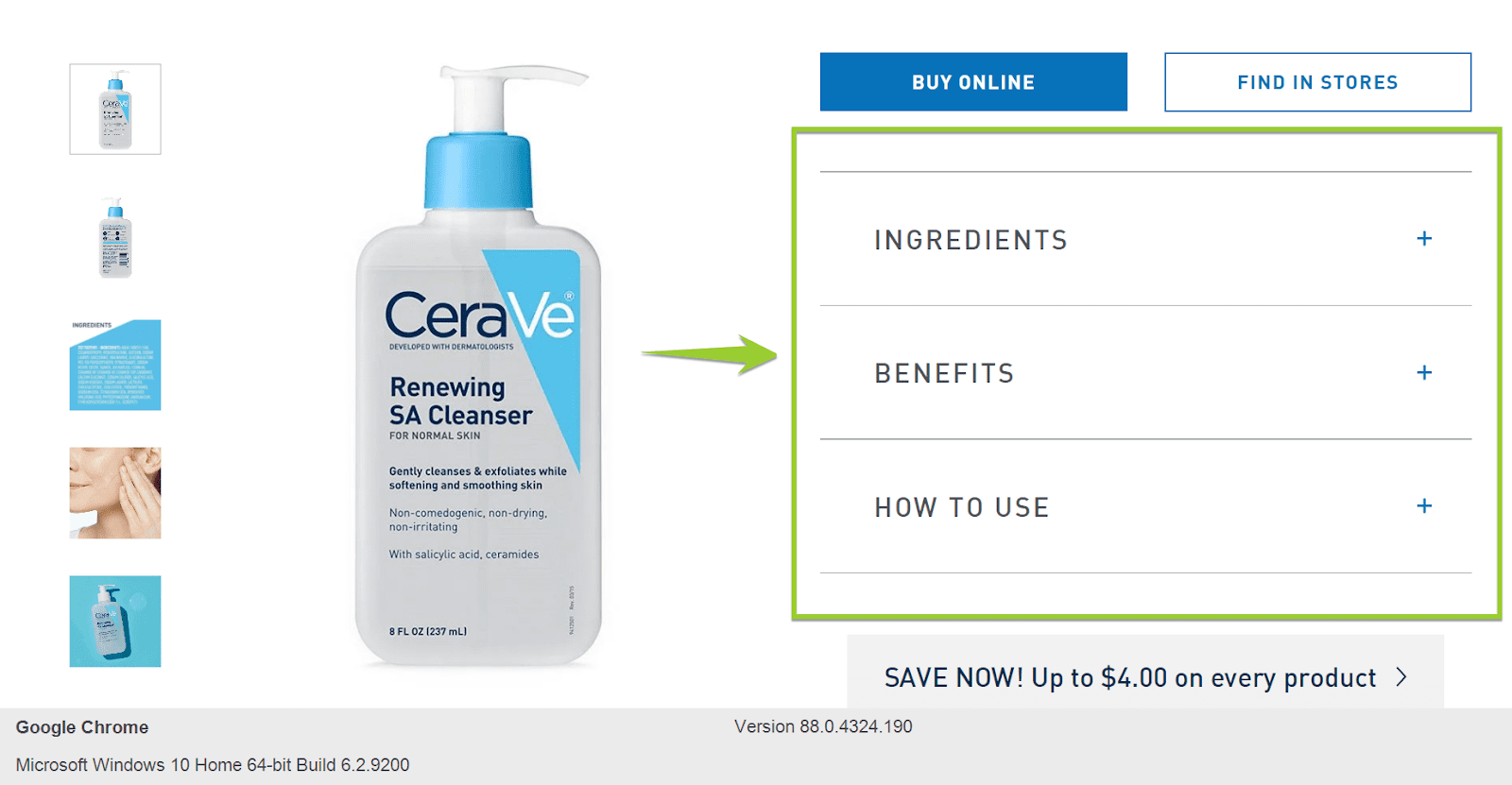
- Beauty industry:
Ingredients, benefits, and a how-to-use guide along with multiple pictures to increase transparency and build trust.
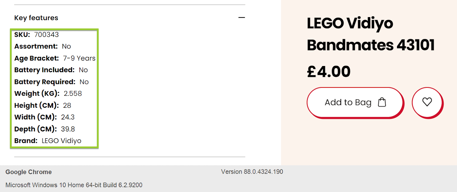
- Toy industry:
Key features and a clear CTA.
7. Product variations – color and size
Product variations help to make items more visible, as some colors or sizes may have been lost down the Amazon ‘black hole’ on the 30th page of the search results. By appearing on the same product page with colors and sizes ranked high in the search, these SKUs become more visible.
8. Pricing
The price you charge your customers will directly impact the profitability of your company, no matter what type of product you offer. Therefore, review prices regularly to reflect the dynamics of the costs, market demand, competition response, and profit objectives.
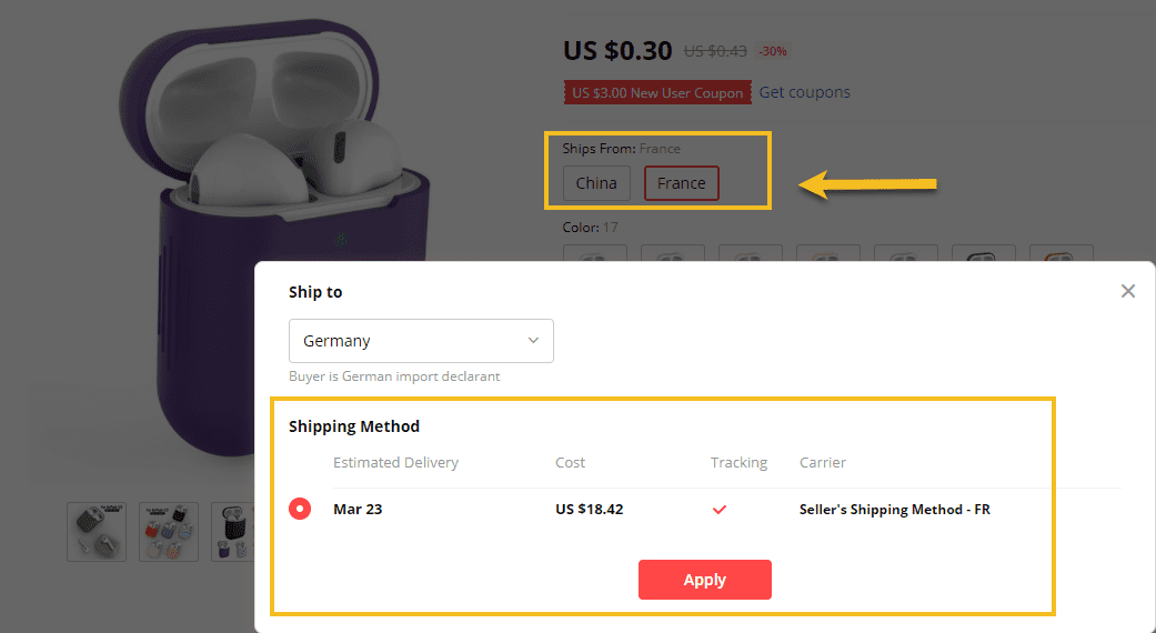
9. Shipping Details
Creating your online store’s shipping strategy helps you make sure everyone involved in this system knows what’s going on and how the shipping process works.
10. Call to action button
CTA’s will help you guide your guests through the purchasing journey and directly affect your conversion rates. When attracting your customers’ attention, a very productive CTA can do wonders, piquing their interest and eloquently guiding them through the signup process.
11. Add to cart
Typically, people know what they want to buy, so they don’t necessarily read all the information about the product. The “Add to cart” button on the product list speeds things up for the consumer, and without additional actions, they can compare product prices and add them to the cart.
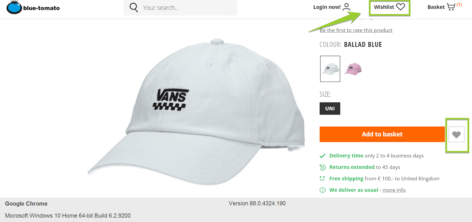
12. Add to Wishlist
It’s simple and convenient to add products to the wishlist, but it can also push the consumers to purchase even more products than intended. For example, users can share their wishlist and decide upon a product to help their friends select a gift for an upcoming holiday.
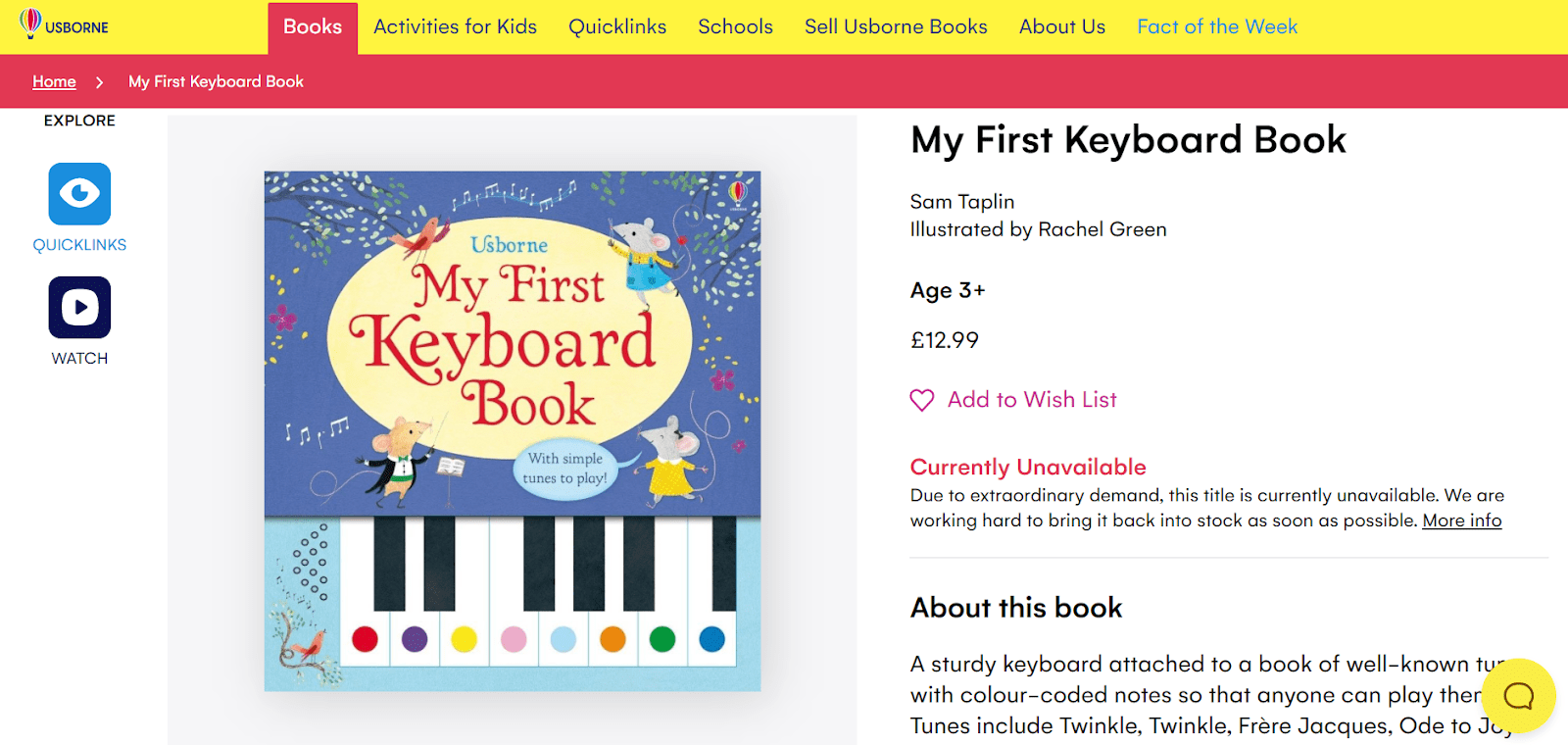
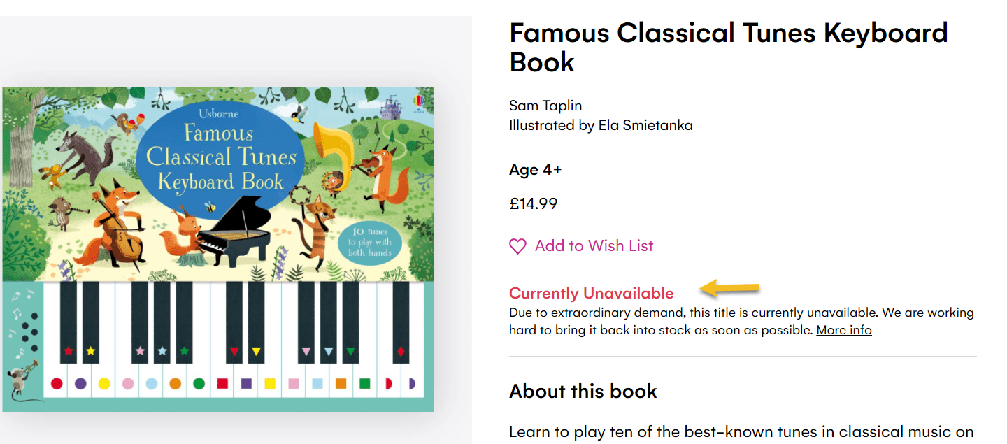
13. Stock Information
Nowadays, customers want clarity when it comes to dealing with e-commerce brands. You risk delaying the delivery and potentially undermining the trust you have built up with people who want to order your product if you don’t handle your stock and inventory appropriately. A simple remedy for this will be to mark goods online as in or out of stock so that consumers can see quantities available for themselves.
14. Product reviews in a star format or number format
Customer reviews produce something known as social evidence, a theory that claims that those around them impact individuals. If you like, you can customize the look of your store’s product review forms to appear in the shape of a star to give them more creativity and uniqueness.
Product reviews in a number format are usually used in the case of travel booking.

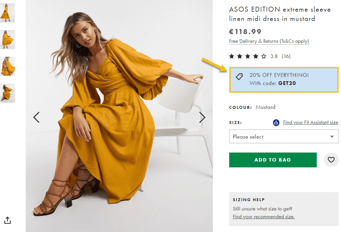
15. Promo Codes
Promo codes are discount codes that can be inserted in a special field in the checkout process to reduce the final price of a product or a series of products.
Let’s say you’re offering 20% off with promo code 20OFF; you can show this below the price. Then, after adding to the cart all your products, before proceeding to payment, a user will have a field where he can paste the code and benefit from the discount.
16. Extra important info like guarantees
If, within the timeframe of the legal guarantee, the product you sold turns out to be defective or does not look or function as advertised, you are responsible for this. It’s important to include information that covers this aspect in regards to every product you sell.

17. Trust badges, essential for newcomer online stores
Although customers are interested in shopping online and find it more convenient, they also search for trustworthy websites. Therefore, you must protect them and their valuable information as an e-commerce business owner. This is where trust badges come to the rescue. You can have a badge that says you are the official seller, or you are certified by an institution, maybe you are part of a group of companies, etc.

Elements Below the Fold
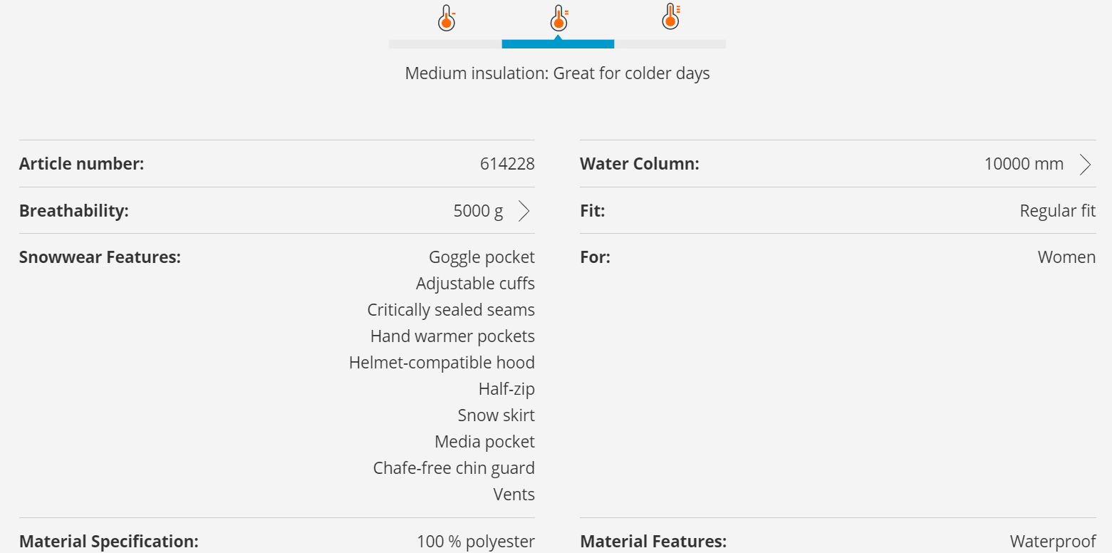
18. Detailed product description
Whether your products have a particular function, such as a camera, or a specific purpose, such as fashion, all products exist to strengthen or improve the quality of life of the purchaser in one way or another. This is why a detailed product description is a must-have. Check out the example below to get a better understanding.
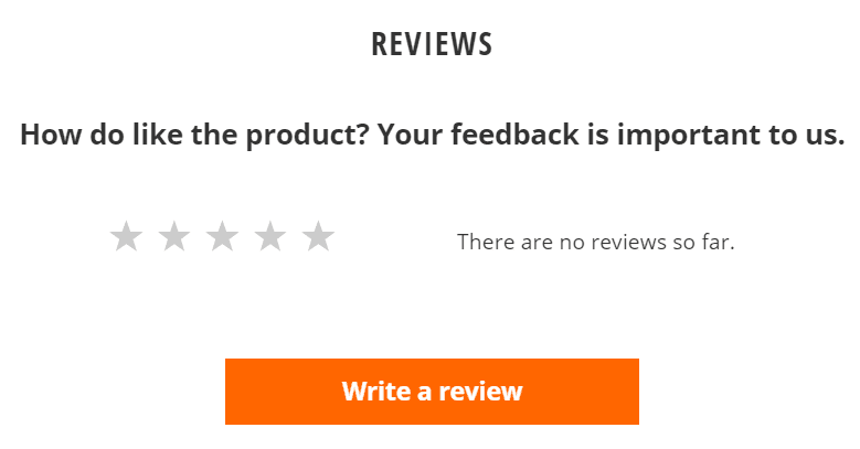
19. Detailed reviews + option to leave a review
Social proof is a fundamental psychological phenomenon. Moreover, it’s an outstanding marketing strategy to legitimize your products, services, and your company.
20. Similar products / You might also like
This is a popular e-commerce site feature for one simple reason: they might convince the user to buy. Maybe that particular red dress is not quite the proper length. An option would be for the user to leave the site. But if they see below the product a list of similar red dresses, they might give you another shot.
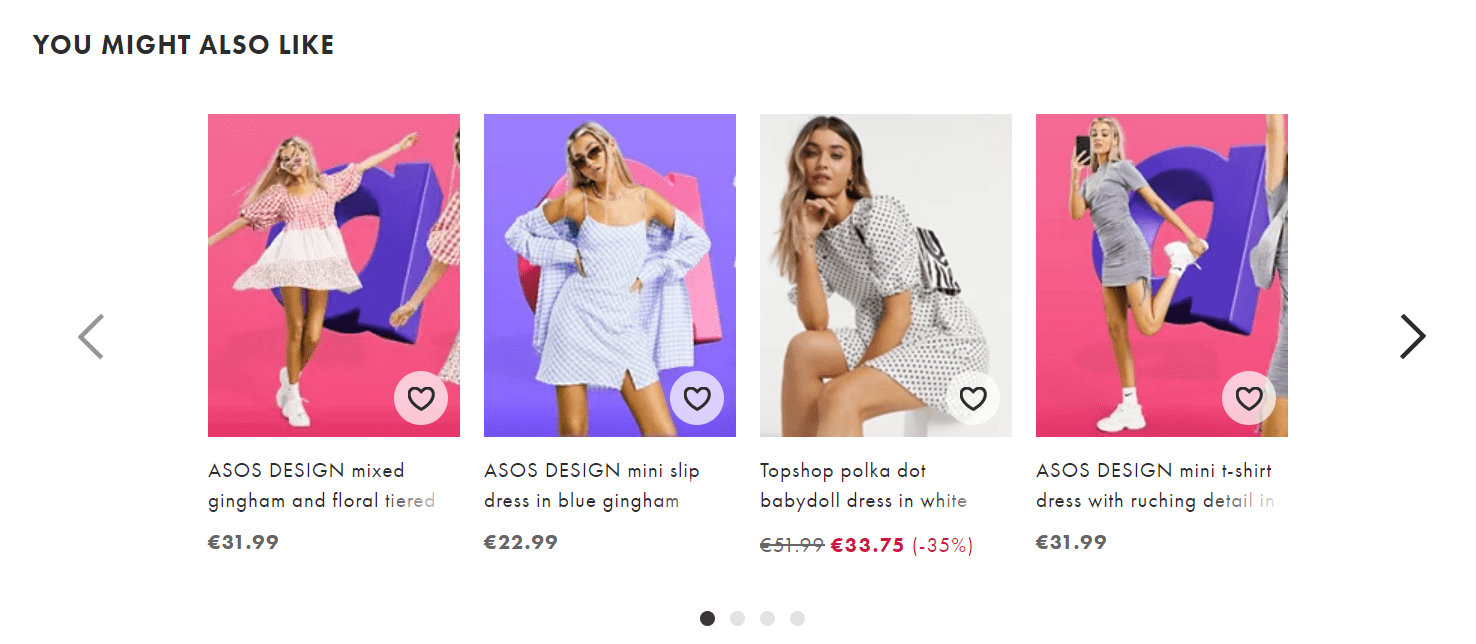
21. Other people bought
Such a section will show that other people trusted to buy a particular product, and it works as social proof: if they bought, the user could buy as well.
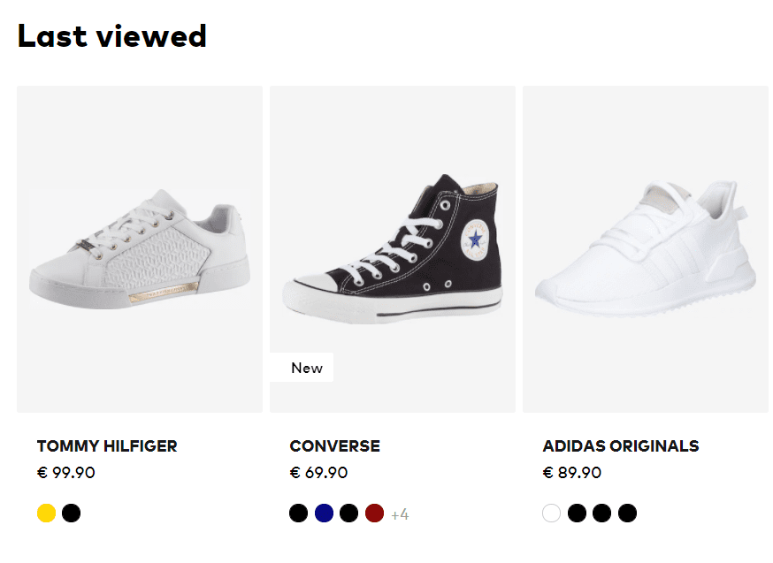
22. Previously seen or liked products
This makes it easy for users to return to previously seen items and consider buying them once more. It will make their buying process easier. A user often wants to go back to a previous item, but it can be quite daunting remembering the filters and sorting he made until he reached that product. This feature is a handy shortcut.
23. This product works well with…’/Related products
It can help increase order value, especially for fashion stores, and generally with LTV – lifetime value. Customers like similar items because once they see a nice pair of shoes that go perfectly with the dress they recently bought, they’ll be tempted to buy more.
24. FAQ
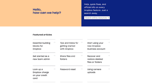
Keep FAQ responses succinct and provide links on your site to more in-depth information elsewhere – see example below:
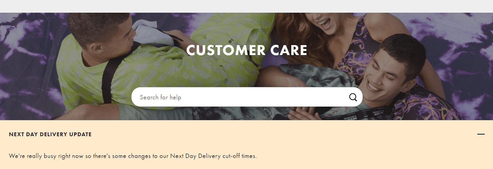
25. Customer care & Support information
Both Customer Service and Customer Care Teams are critical to the customer experience that your business delivers. They both use email, chat, and phone tools to communicate and enable people to reach out if they feel like it.
26. Social media buttons
This is an efficient way to increase your number of social media followers.

27. Newsletter information
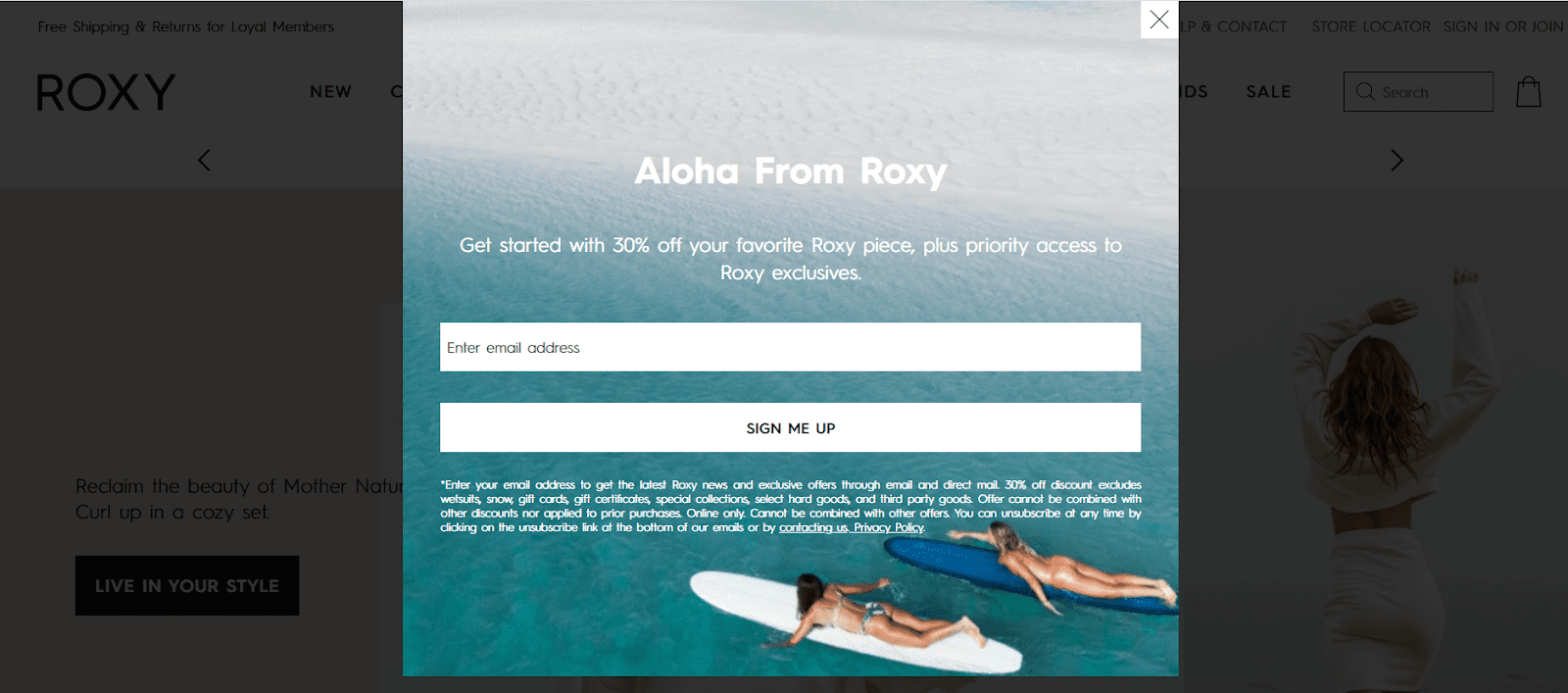
You can invite your users to join your newsletter. Newsletters are tools that inform your customers about new products, promotional deals, or events. In addition, they can be employed in retention strategies.
Now, let’s explore something more visually appealing and eye satisfying: your product page’s design!
7 Product Page Designs That We Love
Although they all mean the same thing, product pages in various eCommerce stores can look quite different. Some have fancy and complex templates, while others keep it simple and concentrate on increasing conversions.
To help you feel captivated, we’ve gathered 7 of the product page design examples we like most, looking at the layouts of some great brands and businesses. Drumrolls, please!
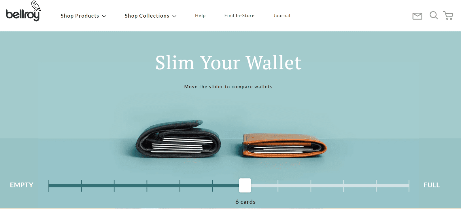
Bellroy sells skinny and soft wallets and has split its product page into three phases of the purchaser’s journey: understanding the problem, fixing the problem, and how they can actually solve this problem.
Users can move the slider back and forth across the line, and both wallets will fill up with cards and cash, visibly exhibiting the very problem that Bellroy’s tries to tackle. Its product page design is sharp, on point, and very eye-catching. Aiming for something unique might have the positive impact you’re looking for.
What we like about this store:
- Bellroy provides intuitive navigation and a sense of continuity to its website.
- The slider that moves back and forth improves user experience and gives an overall feeling of ease.
- The product pictures are of high quality and they even provide video content for a better insight.
- Information is easily accessible and this leads to an uptick in conversion rates.
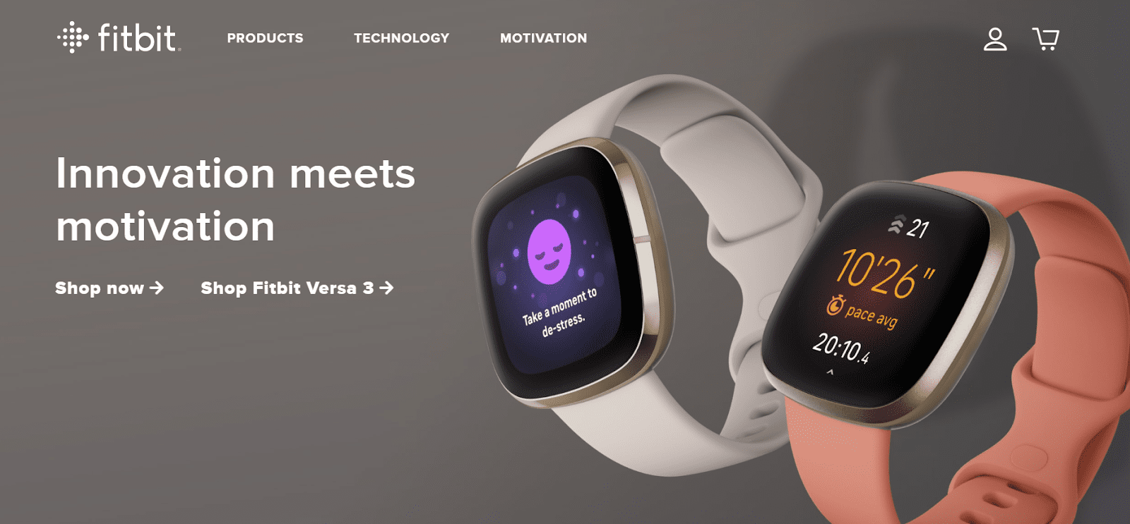
Fitbit’s mission is to inspire people to become healthier and more active by using Fitbit products, apps, and services. The social element of the device fuel Fitbit’s growth. However, their page design strategy can’t be left in the dark.
What we like about this store:
- The contrast between lighter and darker hues provides a sophisticated atmosphere to the website.
- An image carousel and a gradient effect are included in the current version of the website. It’s nothing flashy, but it makes this the best-looking Fitbit web design to date.
- Detailed product descriptions, top-notch pictures, and clear copy are once again the heart of the game.
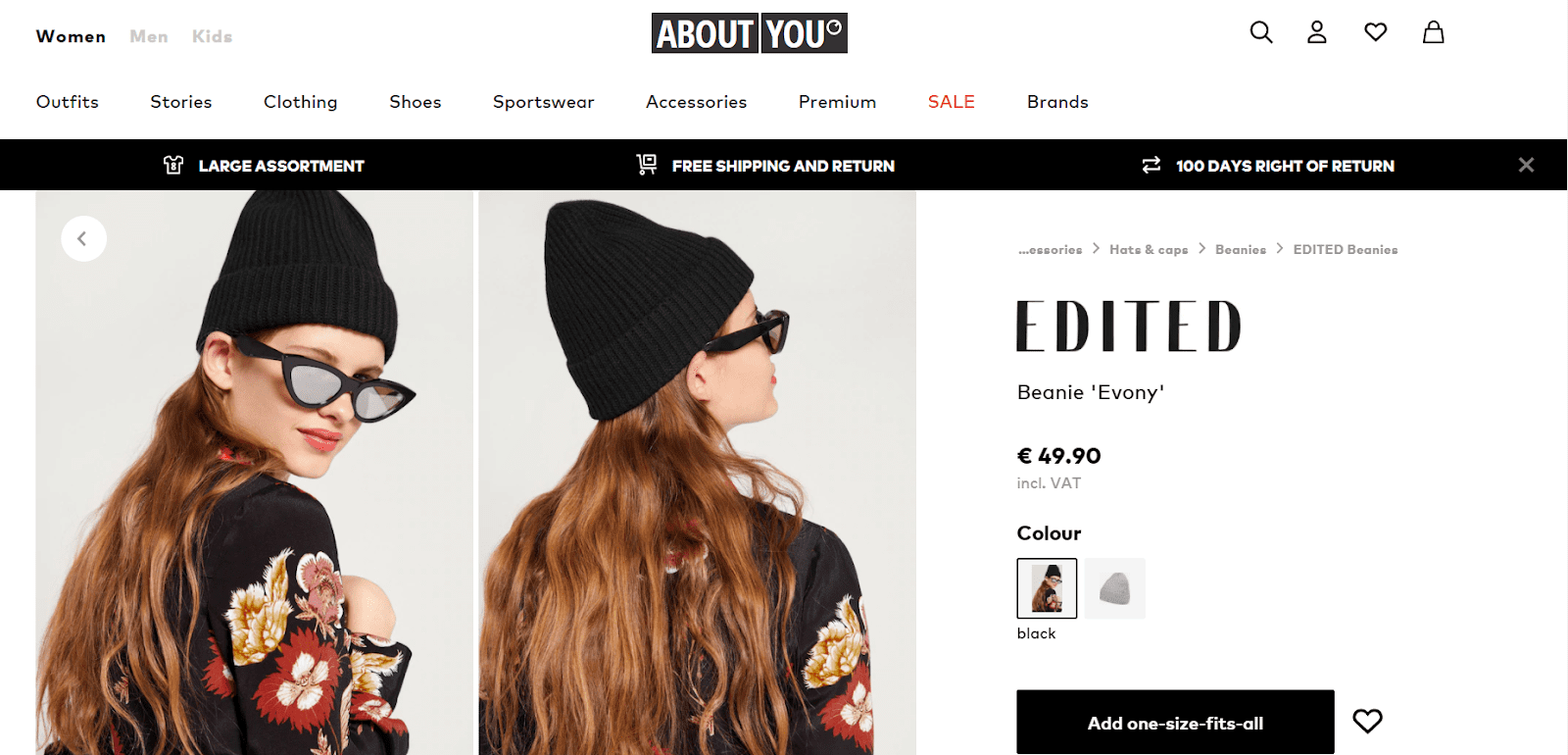
Fashion is a very graphic industry. Optics is the first thing your clients would like to see before they make a purchase decision. Therefore, the best copywriting is worth hardly anything unless it is surrounded by great imagery.
Large, daring product images, polished videos, fast loading time intervals, and a watery, seamless checkout sequence—these are the essentials of any fashion e-commerce website.
What we like about this store:
- The elements don’t feel cluttered, and you can immediately get a grasp of the product you’re viewing.
- Bright and high-quality pictures taken from multiple angles showcase everything you need to know about the product’s features and characteristics.
- Mobile-friendliness – product images, text, product information, and checkout cart are all readily accessible.
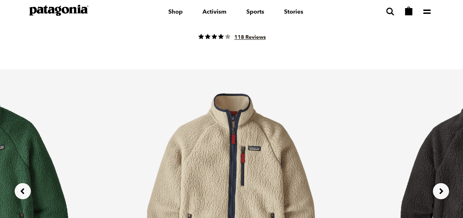
Speaking of the fashion industry, here’s another excellent example of a sleek product page design. Patagonia uses large, daring product images, polished videos, fast loading time intervals, and a watery, seamless checkout sequence. All of these combined make up for the essentials of any fashion e-commerce website.
What we like about this store:
- Patagonia’s “what’s my size” feature is one of the most helpful eCommerce features you could ever use if you’re running a fashion.
- User-friendly navigation, well-organized headlines, bold and sharp images.
- Their custom configurator offers a one-of-a-kind, educational shopping experience, in which consumers learn about something new and different.
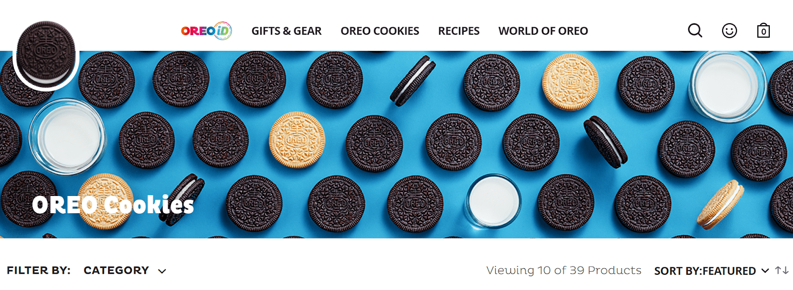
Well, Oreo does more than making your mouth water.
The spotlight of Oreo’s product page is about how these classic cookies can help people unlock their imagination and creativity, feel compelled to wonder, and become happier overall. Although the cookies themselves are black and white, the page is beautifully colorful, from videos to backgrounds, to graphics.
What we like about this store:
- Enough white space to differentiate product information.
- Options for cookie customization are available right away. Yes, you can customize your Oreo cookie.
- The page itself gives a sense of playfulness and creativity with its bright colors, graphics, and videos.
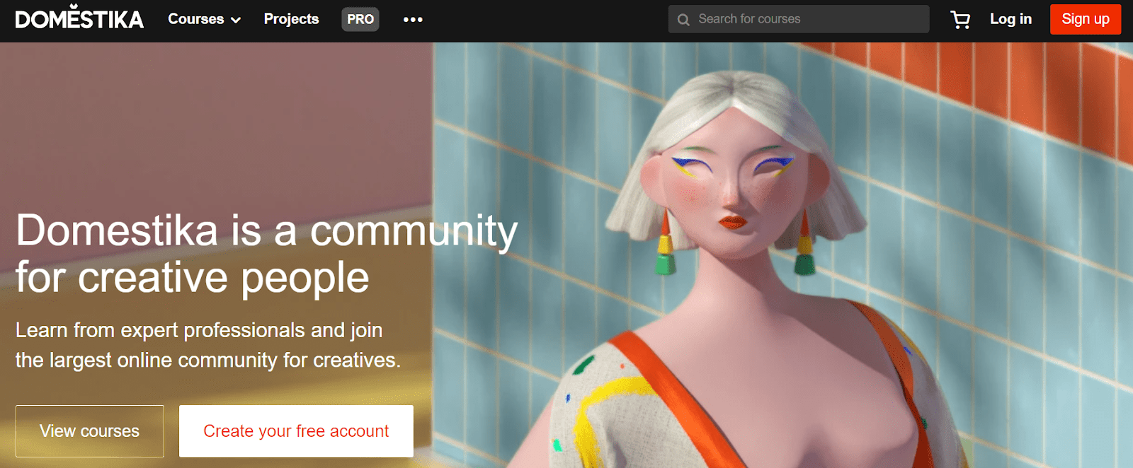
Domestika is an online learning platform for creative people that provides software, crafts, illustration, and other subjects. Its unwavering emphasis on creative people characterizes Domestika. Of course, there are a few courses on Python and web programming, but most of the courses are on innovative topics and tasks, similar to what you’d find on Udemy or Coursera.
What we like about this store:
- The ‘like’ and ‘comment’ section at the end of each course helps build trust among the customers and creates a strong and reliable product.
- Unique and creative front-page picture that pleases the eye.
- Each course is clearly highlighted and divided, thus making it easy for the customer to pick one.

Despite the broadness of their products and services, Apple has given a comprehensive structure of information on their site. The top navigation bar showcases only seven choice categories and icons. Users have a good understanding of where to navigate. Complicated menus can exacerbate user experience and lead to higher bounce rates and higher customer demoralization.
What we like about this store:
- Apple ensures that users can quickly and easily find the products they’re looking for by establishing an organized and defined navigation system on their website.
- Each product is described with an inventive copy and eye-catching images.
- The website has an overall attractive brand identity and clean layouts which leads to an improved UX.
Bottom Line
Product pages are the backbone of your e-commerce website. With small adjustments, you can convert more visitors to customers and increase your sales revenue.
So now that we’ve reached an end, here are some top key takeaways you might want to remember when designing your eCommerce website:
- Make it easy and straightforward.
- Keep things exciting and fun, especially if you’ve got a less-than-riveting product.
- Make it unique. Be sure to include the correct bits of information to show users what sets your products apart from others.

Gabriella is a Digital Content Writer and Marketer with a zeal for all things WordPress. When she’s not researching and drafting the upcoming articles, you can find her in the open air exploring the outdoors with her dog.






Comments are closed