Running an online store ain’t an easy job.
First, you need to build it, then promote it, then make sure you can retain your customers, but also increase their lifetime value. And, let’s face it, the competition will try to do the same.
Talking about the competition, there’s always a lot to learn from the big guys when it comes to designing an online store. This is why I’m still having a jaw drop when I discover poorly looking eCommerce websites. I mean, inspiration is just around the corner…
So, in this article, I’m going to provide you with inspiration from well-known electronics brands and their website optimization strategies. We’re going to meet with Samsung, Sony, Apple, Gearbest, and B&H Photo Video. Deal?
First, let’s understand what conversion rates are.
Ecommerce Conversion Rates for Dummies
An eCommerce conversion rate is the percentage of website visitors who bought something from your online store across a period of time.
Now, eCommerce conversion rates can be analyzed across:
- Devices
- Regions
- Browser language
- Running campaigns
- Returning versus new customers.
and more.
There are several tactics that can help you increase conversions rates across an online store, but, beware, your end goal should be your return on investment and the customer lifetime value or CLV. CLV is a measurement of how valuable a customer is to your company. CLV is measured across the whole relationship with your customer, not just based on a purchase-by-purchase basis.
In the long run, you should ideally increase both your conversion rate and CLV.
What else you should know is that besides purchases, you can also keep an eye on some micro-conversions. These refer to the completion of secondary actions by website visitors that can show an intent towards conversions. Micro-conversions optimization will lead in the end to an increase in total purchases. Let’s look at some micro-conversions:
- A user adding a product to their cart;
- A user adding an item to their wishlist or marking it as a favorite;
- Newsletter signups;
- Account creation;
- Or any other goal that your brand could assign a value to.
How can you measure both the macro and micro-conversions for your online store? By using Google Analytics. Here’s a detailed article on how to do this. And, what’s awesome is that this is a free tool!
Now, what should you take as a benchmark for your conversion rate? You should know that they vary across industries, as shown in this graph from IRP Commerce.
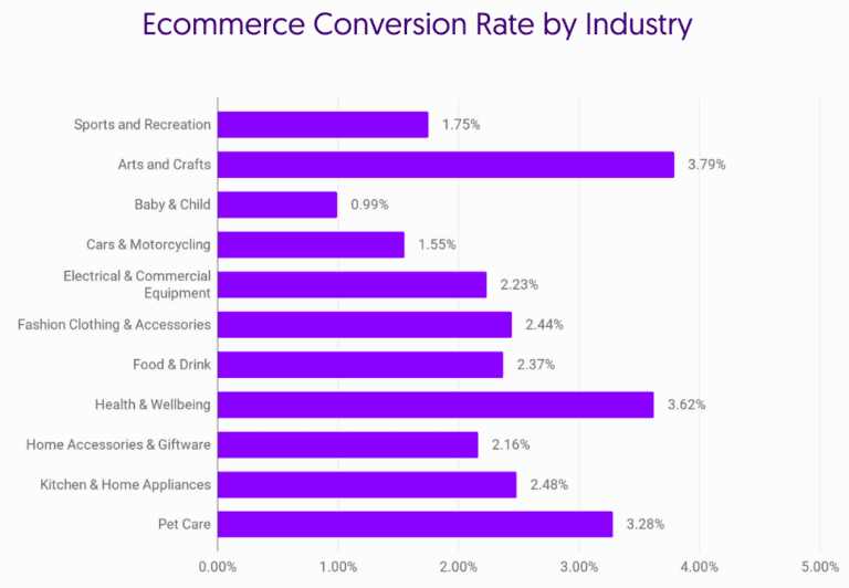
This means that for the electronics market, your benchmark should be around 2%. Let’s not forget that averages do not tell the whole story. In this case, the folks at Growcode are showing us the lower performers and the outperformers as well:
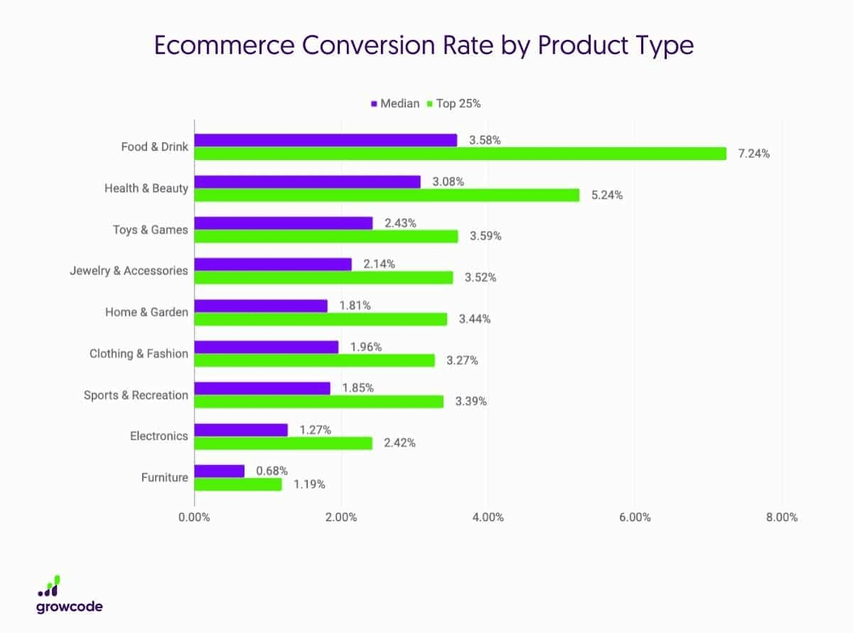
What does this mean for you? That with the right tools and strategies you can beat the average.
So, let’s look at those strategies, shall we?
How Samsung, Sony, Apple, Gearbest, B&H Photo Video, and Apple Optimize Their Websites
- Use high quality product imagery
There are still people out there that can’t imagine themselves shopping online. They need to touch and feel the product they’re buying.
The rest of us are happy looking at highly detailed product images, and even videos.
Now, here I have a “don’t” for you. I was looking at the Sony product images. They have a vertical carousel. When you click on the up and down arrows, the images don’t change, you’ll need to click on the image itself. This is not a good user experience.
Apple takes this chapter to a whole new level. It brought Augmented Reality to the table.
- Leverage user generated content
You’ve probably noticed lots of hotels and places tagged in your Instagram feed…
Well, that’s an example of user-generated content or UGC, meaning any form of content (text, images, video, reviews) created by individuals (not brands) and published online.
User-generated content has a huge impact on the purchasing decisions of others. It works like social proof. Data shows that this type of content is very trusted, memorable, authentic, and influential. The folks in Stackla surveyed 1,590 consumers and 150 B2C marketers from the US, UK, and Australia to understand the power of UGC. They found out that 79% of people say UGC highly impacts their purchasing decisions, yet only 13% said content from a brand is impactful and a mere 8% said influencer-created content would highly impact their purchasing decisions.
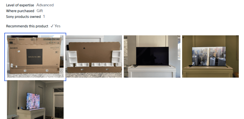
Now, you should know that reviews also count as user-generated content. But how do you feel about reviews with product images?
I’m talking about Sony, which allows its customers to upload images of Sony products they bought.
- Add a wishlist to your product page
A wishlist allows potential shoppers to save the products they like or want to buy in their user account for future reference. Wishlists show that the users have an intent towards that product, they’re close to making a purchase. Make sure your wishlist option is clearly visible.
Now, the folks at Gearbest have this wishlist feature right beneath their “Add to cart” button. And the cool thing is that they add social proof to it. In this case, 991 persons have added the same product to their own wishlist.

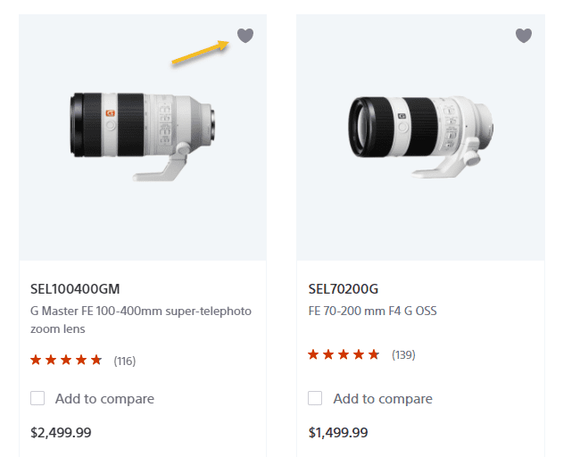
Sony uses a shortcut to the wishlist. It uses a heart symbol placed on top of the product image, in the listing, so that it can help visitors add products to the wishlist with ease.
- Recently viewed items
Oftentimes, when we navigate an online store, we want to go back to certain products. But, we can’t always find them.
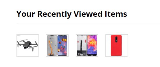
This is why a feature that can show us the recently viewed items is a gold mine both for us and the online store. This is a strategy that can lead to higher purchases.
The folks at Gearbest are using it.
- Making product suggestions in the cart section
So, your future customer has added stuff to the shopping cart. Now, the purchase shouldn’t stop here. What if you personalize that cart page and suggest some additional products or services?
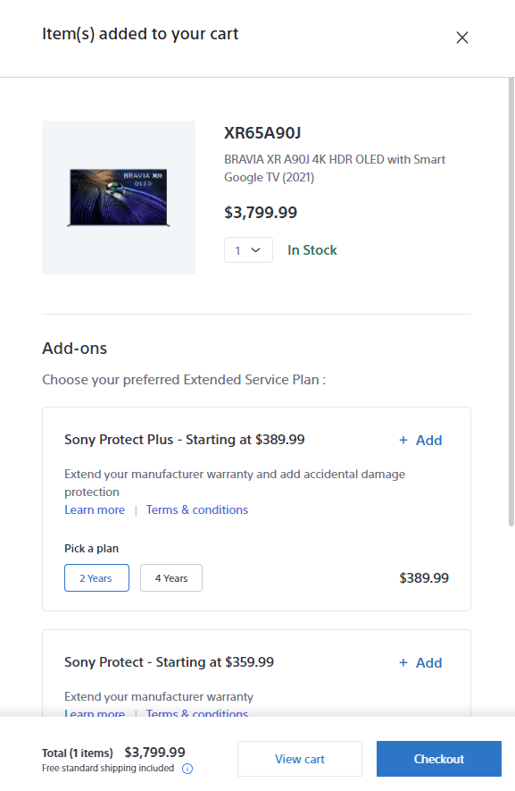
Sony, for example, is suggesting additional warranty features and installation services.
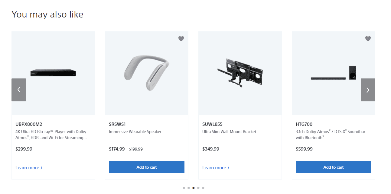
They also feature a “You may also like” section on the cart page where they show items that complement the products in the cart. That’s cross-selling, folks!
Apple is also making some accessories suggestions during the checkout process. One tip here: try to push accessories that are not expensive. In this case, when a MacBook costs $999, a magic mouse of $79 is a bargain, wouldn’t you say?
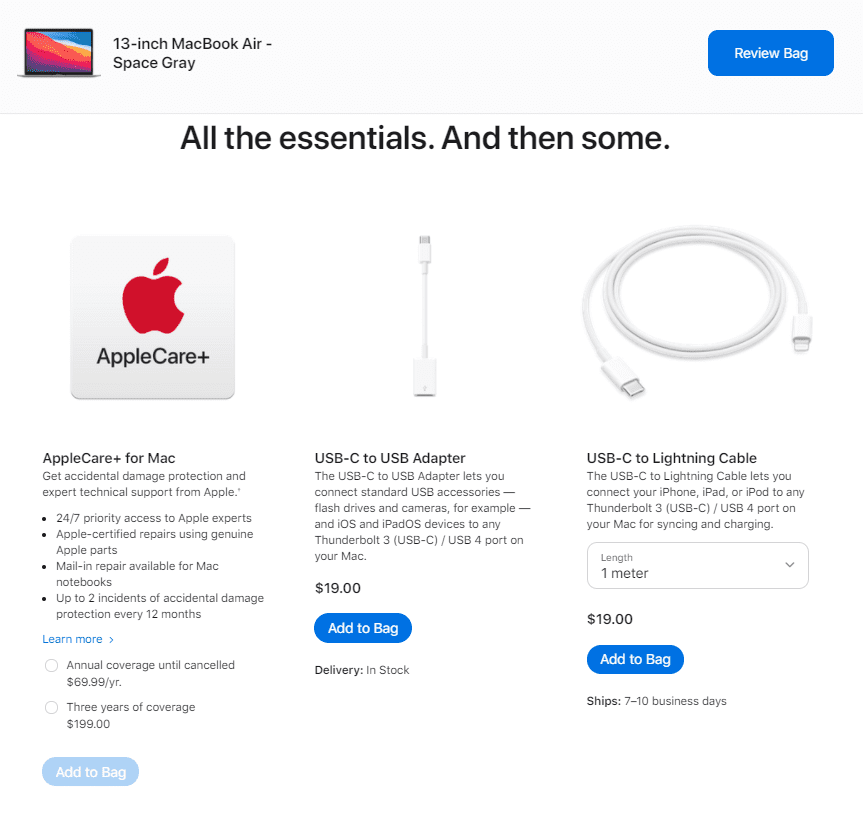
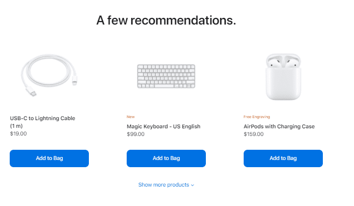
If you haven’t yet chosen an accessory, when you review your bag, you’re shown some other options. Apple doesn’t want to lose any opportunity for cross-selling. And they start from a cheap product, till they add a not so cheap one.
- Making products on sale stand out
We do love a bargain, don’t we? And electronics bargains are really valuable because electronics aren’t always cheap. So, the moment you have an item for sale, make sure it stands out.
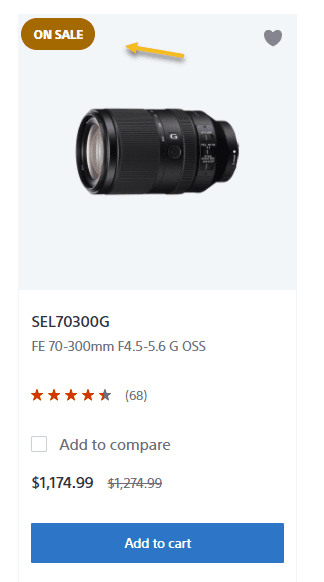
You can easily do this by applying a badge to the product image as Sony does.
You can also announce your promos on the homepage, in a slider with all your special offerings, like in the example below from B&H Photo Video. They are announcing their Back to School Apple offering.

Below, on the page, they also have a deals section. Do you notice anything interesting here?

They are not using 15% off, their savings are not expressed in percentages, but in absolute values” Save $50, or $100. Psychologically speaking, it seems that if a product value is above $100, if the discount is shown in a numerical value, the offer will look more attractive in the eyes of the buyer.
Now, let’s say you’re selling some accessories that are below $100. How would you feel if you saw 20% off versus $4 off? You’d probably go for 20% off, even if it will be the same as -$4.
But, don’t take my word for it, you could always A/B test.
- Notifying when products are back in stock.
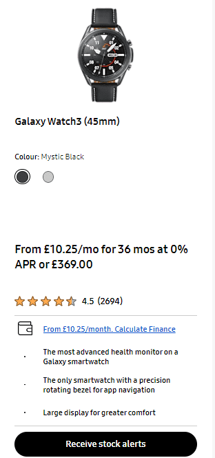
If the product is out of stock, don’t hide it from your products. You can use a filter for that, to show in-stock and out-of-stock products. But, let’s say something is out of stock and someone really wants that product. You can use a feature that allows you to notify the potential customer when the product is back in stock.
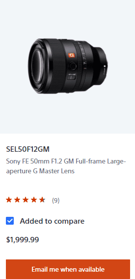
The same goes for Samsung, they have a call to action button underneath the out-of-stock items saying: “Receive stock alerts”.
- Make use of product comparisons
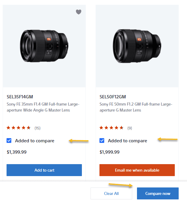
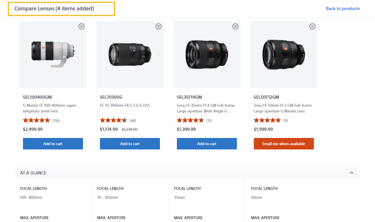
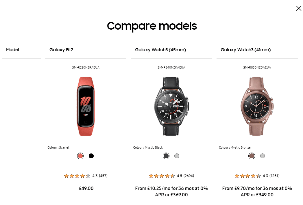
Making a choice is not an easy thing, especially when the features seem very similar. Also, in the case of electronics, for certain products, there can be big budgets at stake. This means that the buyer needs to be able to make an informed decision with ease.
This is why product comparisons are a must.
In the example below, Sony allows its website visitors to compare lens characteristics.
The same goes for Samsung
and Apple.
- Related products feature
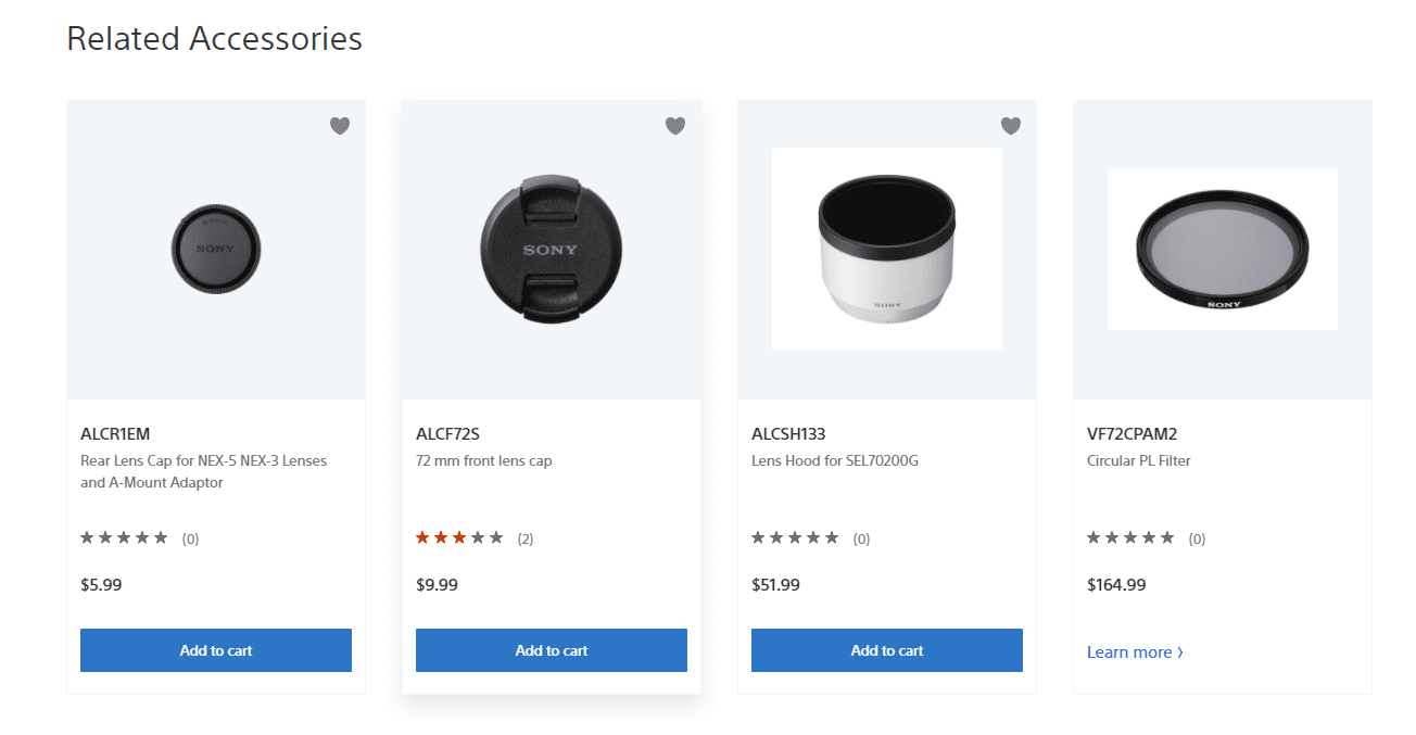
Electronic products often need certain accessories. You should make it easy for your potential customers to find them. Some of them won’t even know that they can pair a lens with a filter, for example. Or what about suggesting a phone case to the Samsung Galaxy you’re just looking at? Either way, you would have bought one, so why not enjoy a frictionless buying experience?
Now, Sony has designed on its product pages a section called “Related accessories”. It has two purposes:
- Designing a seamless shopping experience;
- Increasing the cart value for its customers.
- Make customer support frictionless
Make sure you have:
- A Frequently Asked Questions section or page on your site;
- Info on warranties and shipping;
- The possibility to easily get in touch with support via chat, email or phone.
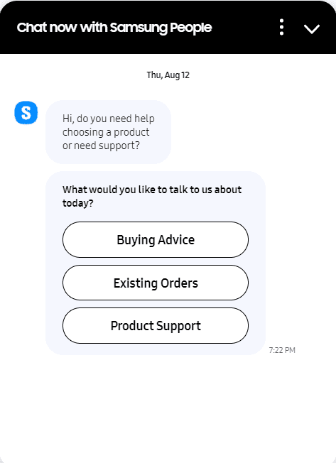
In the case of Samsung, a chatbot is being used to solve the problems potential customers might face.
Apple has also designed some Virtual Sessions where they teach customers how to use their products.

- Offer vouchers and gift cards
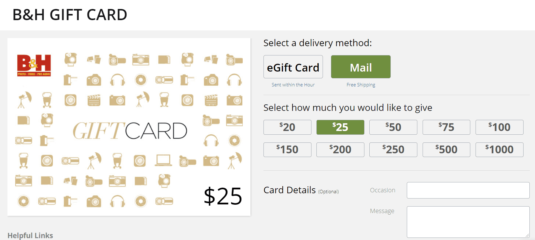
Vouchers and gift cards are excellent ways to boost your customer lifetime value or CLV. Gift cards are also a great tool for bringing in new customers as well (the ones that received the gift).
B&H Photo Video is very flexible when it comes to gift cards: they allow multiple sum choices.
- Allow site search
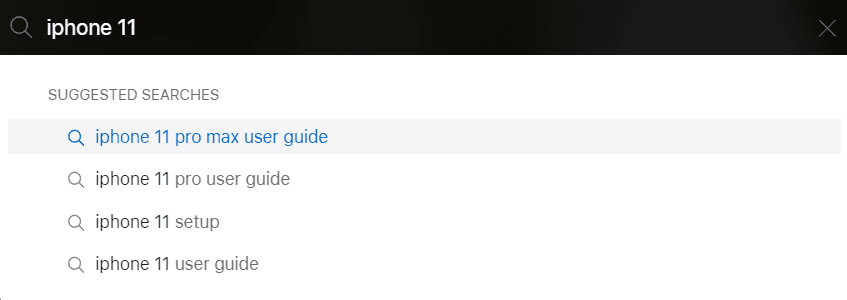
Site search is an essential part of website navigation. It allows for users to go straight to the product they need, instead of going through various filters and sorting options.
In the case of Apple, when someone types in some search terms, a list of suggested searches appears.
- Buy-backs and Trade-ins
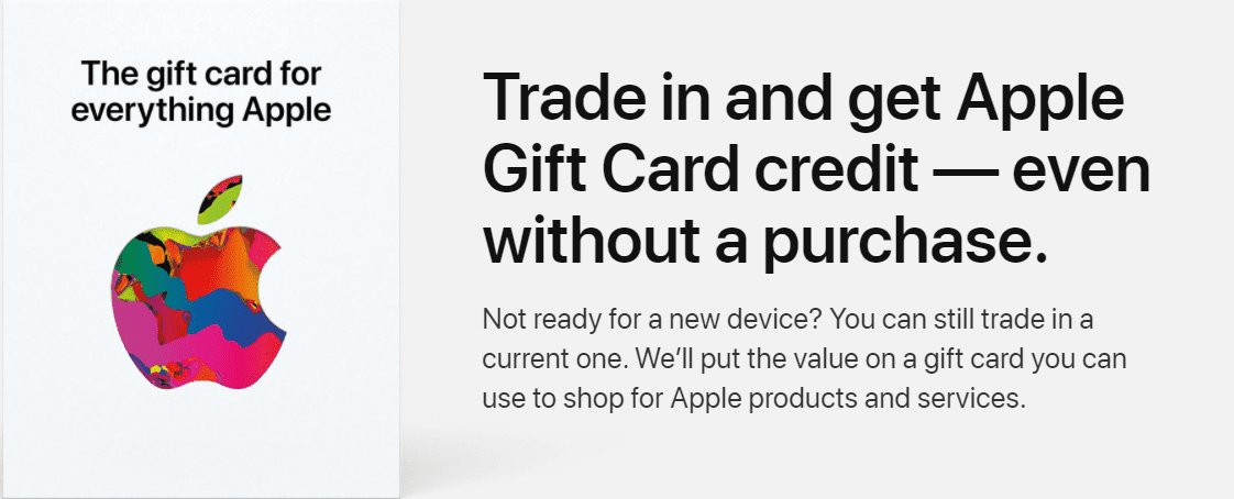
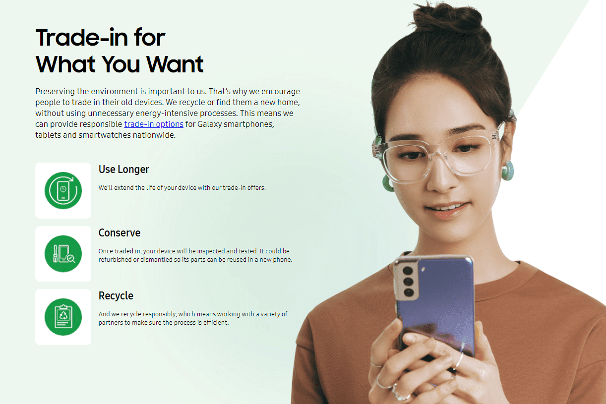
Buy-backs and trade-ins are marketing strategies that can lead to improved customer loyalty.
Apple seems to offer an Apple Gift Card credit even without a purchase when people trade in an older device.
Samsung has a similar program. They connect it with one of their values: protecting the planet.
- Develop loyalty programs
You’ve probably heard this again and again: it’s harder to acquire a new customer than to retain an older one. So, you should focus a lot on keeping the already existing customers. This will lead to increased profits and sustainable growth.
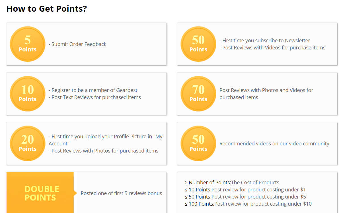
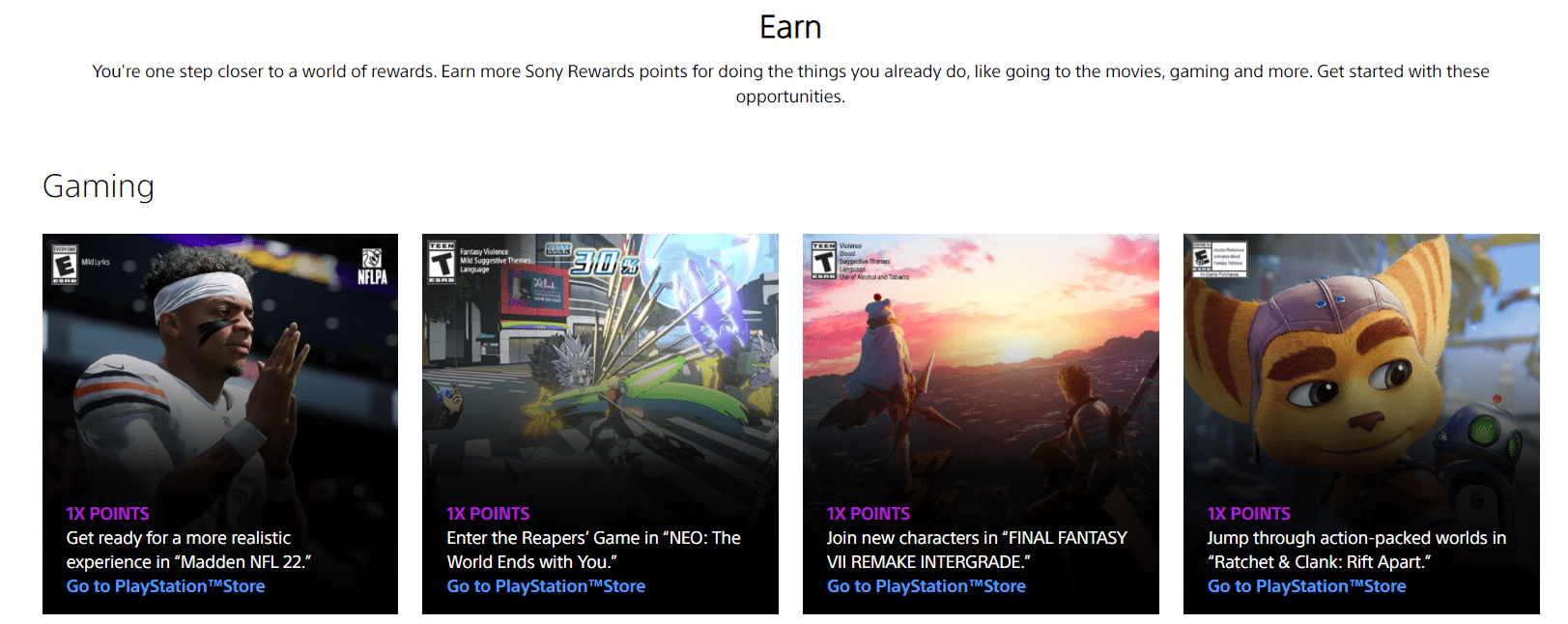
Now, developing loyalty programs is one of the best strategies to retain customers. These programs also contribute to increased customer lifetime values and to stronger personal relationships.
Now, Gearbest has designed such a program where customers are being rewarded G points based on their purchase history, or on the reviews they provide. These points can be used as cash or a discount on orders.
Sony Rewards is another program based on points.
- Group ratings across various characteristics
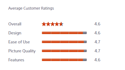
It’s hard to evaluate an electronic device on overall criteria. You can look at the design, price, user experience, and more. This is why aggregate customer ratings aren’t always the best choice. They don’t manage to tell the full story. Try to get your customers to assign ratings across various important features.
For example, Sony has 5 criteria for its ratings:
My list is done! Now, when I made this list, I had an assumption that:
- You allow user post reviews of your electronic products;
- Calls to action are clear;
- Product descriptions are detailed;
- Have a return policy in place;
- Allow multiple payment options;
- Be clear about shipping options;
- Use filtering and sorting options across the homepage and product category pages.
These should be implemented across any online store by default! Deal?
Over and out!

Alina is a digital marketer with a passion for web design. When she’s not strategizing for Colibri and ConvertSquad, she’s doing photography, listening to podcasts on history and psychology, and playing with her 2 dogs and cat.







Comments are closed